
I love studying art history. Besides learning about creativity over time, I’ve learned about color and the complex ways it has been expressed in material culture. This inspires me to make my own color charts from my collection of oil paints, to connect with art history and create a richer understanding of pigments in my art practice.
I find intriguing examples of color in art history and archeology. I am drawn to the color in great paintings, but just as often, I’m drawn to color in natural materials in architecture, or in handmade objects like textiles and ceramics. I’ll take my oil pigments and paint charts that approximate what first inspired me. My goal is to develop unique palettes, not recreate exactly what I see in a picture. When I am really curious about certain historical pigments, I can research further to see what was available.
Here are some of my favorite charts.
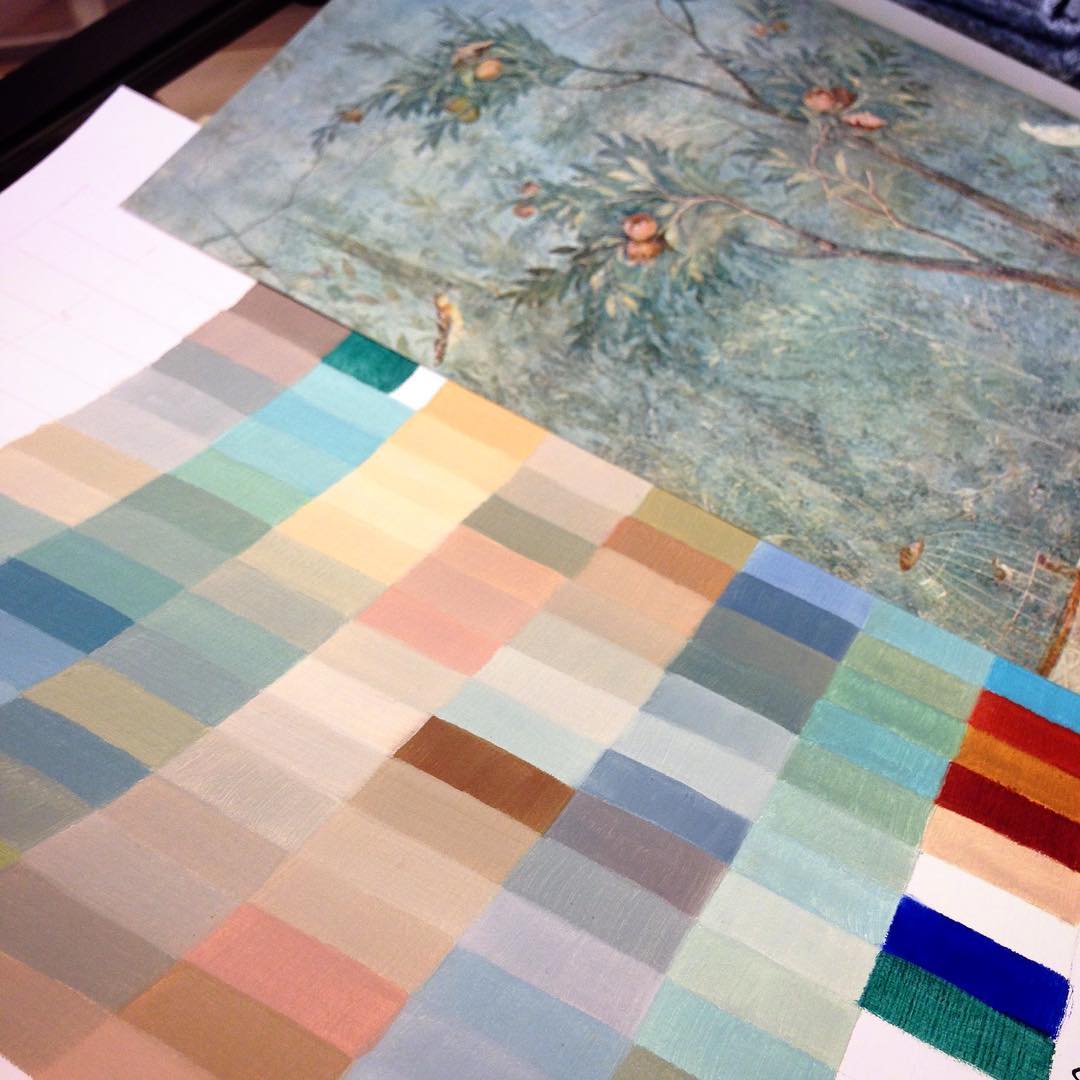
Color chart inspired by a fresco wall, Villa of Livia, Museo delle Terme, Rome.

Frank Gehry’s kitchen, Santa Monica. Found my way around the greens with Italian terre verte and emerald green. As I descend down the rows, some incredible mixes appear in all my charts. Apparently Frank Gehry replaced the color with white in a subsequent remodel – but I love the “before” palette, too!

Another day inspired by Frank Gehry’s materials. This is the Center for the Visual Arts, University of Toledo, Ohio. Lead coated copper panels in the snow. Architectural alpenglow. Effet de Neige. I think I love this one.

Frank Gehry’s Der Neue Zollhof, Düsseldorf is so interesting to analyze. Enjoying all the colors created by plaster, brick and steel in sunlight. Ran out of room before getting to the water and reflections. Definitely need to do more charts of his work.

One of my favorite paintings at the De Young in San Francisco, David Smith’s 1959 spray painted ‘Ovals on Stilts’. Played with his direct blue/orange/white/yellow palette, then kept mixing away into greens, tomatoes and clays. Kept it colorful.
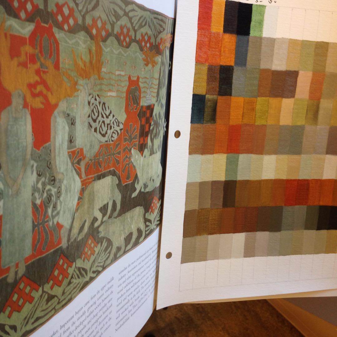
1897 Norwegian tapestry by Gerhard Munthe. The color arrangement surprised me, the figures disappear into the background. I love this palette in oil paint. Definitely a favorite so far, very Pacific NW.

1909 Swedish weaving by Marta Maas-Fjetterstrom, a beautiful moody nocturne. I lightened the palette up a bit to break out the color. I’m having flashbacks to dark winter months during my Seattle childhood, admiring the textile and ceramic art in my Scandinavian American friends’ houses. Lots of candles and Santa Lucia…

Started out looking at colors in Bauhaus teacher Gunta Stolzl’s wall hanging but ended up trying to find subtle combinations of intense primaries. This is a good example of how I finish the charts for my own exploration, not for reproducing the inspiration.

Today’s chart started with Hundertwasser and finished with neutrals helped along by emerald green.

This Renaissance tapestry was woven in Brussels for the Spanish Monarchy, c 1520-30. I’m realizing these artisans understood optical mixing hundreds of years before the French took credit for the concept.

This chart based on an ancient Peruvian (Chimu) litter 1100-1470AD, materials include wood and mother of pearl. Love this color palette so much, a keeper for sure

Nazca weaving 100-700AD. After I figured out the earthy vegetable colors, I added Italian terre verte and created rows of neutrals.
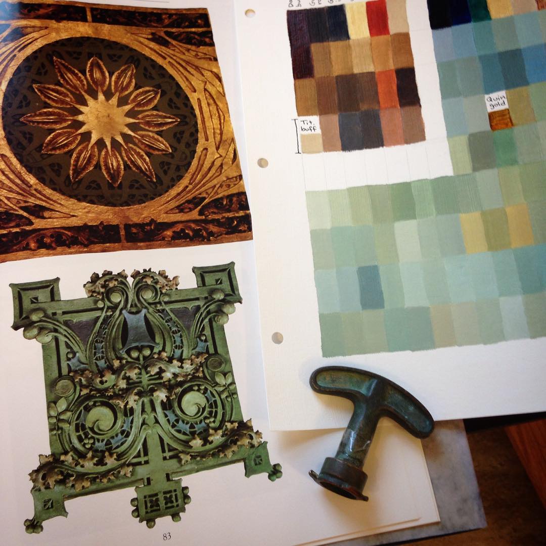
Chicago School! Louis Sullivan, mentor to Frank Lloyd Wright. Ornament from Garrick Theater and Henry Babson House. Love painting the gilt and verdigris.
Here’s a color chart inspired by a Japanese silk wall hanging from the Meiji period. I added mossy colors to make the palette useful for the PNW forests I plan to paint.

And todeii (today), a chart inspired by ancient Pompeii. Impossible to go wrong here with these colors, an earthy red/green combination is naturally welcoming.

Exploring colors in a Persian royal portrait, Mughal, India c. 1650. Love the turquoise, and also the clays and sandy greens.
This chart making has improved my fluency in the studio. I’ve developed an intuition for what pigments will do in mixes and in different application techniques such as glazing. I’ve learned to substitute modern or non-toxic pigments for the beautiful but poisonous options from the past.
Sometimes painters fall in love with certain pigments but are disappointed when the colors overwhelm or disappear in mixes. It’s frustrating to find this out when you are well into a painting. Making charts is like experimenting with an invite list to create the best dinner party. When I’m planning paintings, I’ll pull out my charts and see if there are existing ones that already convey the right mood. If I have a certain color contrast in mind that will be a focus of the painting, laying the charts side by side gives me excellent ideas to try. It also supports indirect painting, when you need a strategy for your layers and can’t rely on painting over errors with opaque paint.
I will always do these charts. I now have dozens of them and refer to them frequently. In case of fire, I’m grabbing the color charts. I hope you enjoy them.